In-App Notification Center Design for SaaS and Mobile Apps 2026
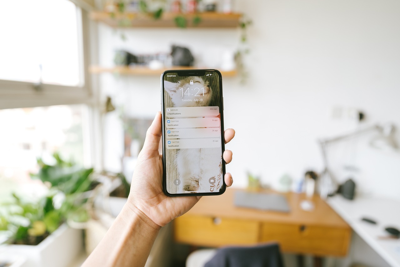
Most apps treat notifications as a firehose. A push goes out, an email follows, and a badge appears somewhere. Users learn to ignore all of it, and the one message that really mattered gets lost. An in-app notification center fixes part of this by giving every important event a calm, searchable home inside your product.
This guide covers how to design and build a notification center for a SaaS web app or a mobile app: what belongs in it, how it relates to push and email, the data model, and the mistakes that make users mute everything. It is aimed at founders and product teams who want a practical plan.
What a notification center is, and what it is not
A notification center is an inbox of events that concern the signed-in user, such as "Priya commented on your proposal", "Your export is ready", or "Payment failed for the Pro plan". It persists after the moment passes, so a user who was away can catch up. It is different from a toast, which disappears, and different from an activity feed, which shows what happened to everyone.
Think of three layers. Delivery channels (push, email, SMS, WhatsApp) interrupt people. The notification center is the durable record. Preferences decide which events travel through which channel. Good products design all three together instead of bolting each on separately.
Why it matters
- Reliability: push notifications can be disabled, delayed, or missed. The center is always there when the user opens the app.
- Less interruption: low-value events can live in the center only, with no push at all.
- Re-engagement: a badge count gives users a reason to open the product, which supports the retention thinking in our guide to push notification strategy for mobile apps.
- Support: when a user says "I never got told", you can check the center and the delivery log.
A real-world example
Imagine a B2B invoicing tool. Events include an invoice viewed by the client, a payment received, a payment failed, a team member mentioning you, and a monthly report ready. If all five send an email, the inbox fills quickly and users filter the sender into a folder they never open.
A better design could send an email only for payment failures, a push for payment received, and keep the rest in the center with an unread badge. This is an illustrative scenario, not a reported result, but it shows the principle: match the interruption level to the urgency of the event.
Step-by-step: building a notification center
- Catalogue your events. List every event worth telling a user about, then assign each a type, an urgency (urgent, normal, low), and a target audience.
- Define the data model. A notifications table usually stores the recipient, event type, a payload with the entities involved, a created timestamp, a read timestamp, and an optional link to the destination screen.
- Separate event from presentation. Store structured data such as the invoice id and the actor, then render the message text in the client. This lets you change copy and support translation without rewriting history.
- Fan out through a queue. When an event happens, a background worker creates the in-app record and decides which channels to trigger. Reliable delivery needs retries, a topic covered in our article on error handling for reliable workflows.
- Build the interface. A bell icon with an unread count, a dropdown or screen listing items newest first, and a mark-all-read action. Each item should deep link to the exact place the user needs.
- Add real-time updates. Use WebSockets, server-sent events, or a periodic refresh so the badge changes without a reload. Choose the simplest technique that matches your scale.
- Add preferences. Let users choose channels per category, with sensible defaults and the ability to mute temporarily.
- Measure and prune. Track open rates, mute rates, and unsubscribes per event type, then remove or downgrade the noisy ones.
Data model details that save pain later
Per-user rows versus shared events
If one event concerns many users, such as a team announcement, you can either create one row per recipient or one event plus a read-state table. Per-recipient rows are simpler and read fast, but write volume grows with team size. For most startups, per-recipient rows are fine until a single event reaches thousands of people.
Read state and bulk actions
Store read status as a timestamp, not a boolean. It lets you show "new since your last visit" and supports analytics. Provide bulk mark-as-read, since users with long lists will not tap every item.
Retention
Nobody needs a notification from two years ago. Keep a rolling window such as 90 days and purge the rest with a scheduled job. Align this with your wider data retention policy.
Designing the experience
Grouping and batching
Ten comments on the same document within an hour should appear as one entry: "Ten new comments on Q3 proposal". Grouping by entity and time window keeps the list scannable and cuts push volume sharply.
Clear, actionable copy
Lead with who did what, then to which object. Avoid vague text such as "You have an update". Where an action is needed, add a button such as Approve or Retry inside the item itself so the user does not need to hunt for the right screen.
Empty and error states
An empty center should explain what will appear there. A failed load should offer a retry, not a blank screen. These small touches make the feature feel finished.
Mobile specifics
On mobile, a push notification should open the app directly at the relevant item, which requires deep link handling. The in-app list should stay in sync with the system badge count, and tapping an item should mark it read. If users often work in poor connectivity, cache the latest items so the list opens instantly, following the ideas in our article on offline-first mobile apps for patchy networks.
Remember that operating system permission prompts are one-shot opportunities. Ask for push permission after the user has seen value, and explain which categories you will send, rather than asking on first launch.
Key benefits
- Calmer product: fewer interruptions, with important items still easy to find.
- Higher trust: users feel informed rather than spammed.
- Better debugging: a persistent record helps support answer "did I get notified?".
- Flexible growth: new channels such as WhatsApp can be added without redesigning events.
- Product insight: notification engagement shows which features users actually care about.
Common mistakes
- Sending every event on every channel by default.
- Storing finished sentences instead of structured data, which makes translation and copy changes painful.
- Forgetting permissions: a user who loses access to a project should not keep seeing its notifications.
- No quiet hours or mute option, which pushes people to disable all notifications at the system level.
- Counting badges inconsistently between web, mobile, and email.
How long does it take?
A basic center with a table, an API, a bell icon, and mark-as-read could be built in roughly one to two weeks by a small team, while a full system with preferences, batching, multiple channels, and analytics might take several more. These ranges are illustrative and depend on your stack and the number of event types.
Rollout plan for an existing product
If your app already sends emails and pushes, you do not need to rebuild everything at once. Start by routing one noisy event type into the new center and watching what happens. Pick an event that users currently receive by email but rarely act on, such as "report ready" or "comment added". Move it to the center with an unread badge, keep a weekly digest email as a fallback, and compare how many people still open the product after the change.
Next, add preferences for that category only. Once the pattern works, migrate further events one by one. This gradual approach limits risk, gives you data on user behaviour, and avoids a big-bang release that could confuse customers or break integrations.
Questions to ask before each new notification
- Does the user need to act, or is this only information?
- Would they be upset if they never saw it?
- Can it be grouped with similar events?
- Is there a destination screen where the action can be completed?
- Who else should or should not see it, given their permissions?
If most answers are weak, the event probably belongs in the center only, or nowhere at all. Saying no to a notification is a product decision as valuable as shipping a feature.
Accessibility and localisation
A notification center must work for everyone. Use semantic markup so screen readers can announce new items, make the bell reachable by keyboard, and never rely on colour alone to show unread status. On mobile, check that VoiceOver and TalkBack read the unread count and the item text in a sensible order.
If you serve users in several languages, remember that structured payloads make translation straightforward. Dates, currencies, and plural forms should be formatted on the client according to the user's locale, so "2 comments" and "1 comment" both read naturally in Hindi, Gujarati, or English.
Conclusion
A notification center turns a noisy stream of alerts into a dependable inbox. Start by cataloguing events and urgency, store structured data, deliver through a queue, and give users control. Measure what they mute and adjust. If you are planning a SaaS or mobile product and want this designed properly from the start, explore our mobile app development services or reach out through our contact page to talk through your event list.
Frequently Asked Questions
- What is an in-app notification center?
- It is a persistent inbox inside your product where users can review events that concern them, even after a push or email has passed.
- Should notifications also be sent by push and email?
- Only urgent events usually deserve interruption. Lower value events can live in the center alone.
- How should notifications be stored?
- Store structured data such as the event type, actor, and entity ids, and render the text in the client so copy and translations can change.
- How long should notifications be kept?
- A rolling window such as 90 days works for many products. Purge older items with a scheduled job.
- How do I stop users muting everything?
- Group related events, offer per-category preferences, respect quiet hours, and remove event types that users consistently ignore.